 I was book browsing... Ha-ha! Nothing unusual there. So, I was just browsing websites to see if anything new had been added or possibly for an older book that I'd missed before, and I noticed there was a trend. The books I always stopped to look at had something in common. Color.
 It didn't matter what genre, and I didn't always buy them, but I stopped to read the title and the blurb. You always hear about how a book cover is the best advertisement you can have for your work, and I'd have to agree the adage is true. Stopping to look at something that is eye-catching is the first step to drawing someone closer to your work.
I was aware I stopped for the covers that were drawn, but those were the only ones I really noticed catching my attention. It wasn't until that particular browsing session a couple of days ago I notice I kept clicking on the covers that had a similar theme, but with something different. Even if I had already read the book, I stopped to look at the cover, sometimes making a mental note to see if the author had something new out or I wanted to reread.

Now, I don't know if the same colors cause other people to stop and look. I imagine personal affinities would have something to do with someone's preferred pallet. My mother and sister both like purple. I enjoy primary colors. Obviously.

The cover also conveys a certain feeling for the book. When I'm looking for sci-fi there are space ships or planets in the background. Contemporary Action/Adventure usually has a character looking badass with a gun and a look of grim determination. Fantasy books have that ethereal feel or a character holding something magical in their hands. MC Romances have a motorcycle or a man in a club cut on the cover.


Another Lexi Fun Fact, once I purchase the book, I rarely re-read the blurb again. Looking at the cover is what usually decides if I'm going to crack that bad-boy open. :)
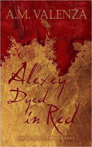
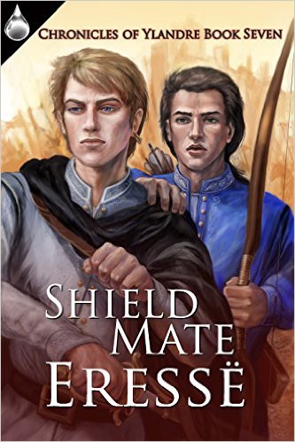
I've attached some more of the covers that caught my eye during my search. Some of them I already own but I stopped and looked anyway. I wish blogger would allow me to put them side-by-side. What a bummer, but you can enjoy them anyway.
Thank you for stopping by and reading!!


Thank you for stopping by and reading!!
Nice & Funny Blog :-)
ReplyDeleteI do read the blurb first and than later look more closely at the cover.
Some of the cover's I like the most are the covers for the Iron Butterfly series of Chanda Hahn, and the underground trilogy of Anna Kyss. No Lgbt books but also nice fantasy :-)